Correlation Radar added to the Dashboard
Correlation Radar added to the Dashboard
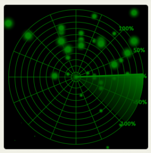
About the Correlation Radar
The EU Risk Dashboard is a web app developed by Open Risk to assist with the exploration and understanding of the large number of economic indicators published by the ECB in its Statistical Data Warehouse. The app data are derived from the timeseries available in the Warehouse. Most readings in the currently selected series are monthly or quarterly and are updated when those become available at the Warehouse.
How the Correlation Radar works
Each data series is normalized and scaled by its volatility (standard deviation). The radar displays all common individual observations (x-axis for the first variable, y-axis for the second). The larger the mark on the radar screen, the more recent the data point. The radar plan position indicator is used to illustrate the magnitude of the measured correlation. It ranges from an angle of -45% for negative 100% correlation, to 45% for positive 100% correlation.
The key difference of the correlation radar with a normal scatterplot is that the later will show the data as they are rather than normalized by their standard deviation. For data with significant differences in variance this can obscure the dependency picture.